Deaths per case
(darker is higher)
This is the eighth and last in a series of status reports
on the COVID situation as at May 23rd, 2022. It summarizes the data
at the world level, and gives some general conclusions about the epidemic.
I’ve also added updates for a few countries up to June 13th.
And though I didn’t cover testing in the seven previous reports, I thought I’d
give an overview of the data on COVID testing in the various countries. I’ve
also included some “post-mortem” style information, to give some idea of the
effects of different levels of testing, vaccinations and lockdowns on cases per
million, deaths per million and deaths per case. I plan a fuller post-mortem in
due course.
My conclusions
I decided, on this occasion, to state my conclusions
up-front. Here they are:
1) Barring
a new and enormously more transmissible variant, the COVID-19 epidemic is all
but over in most countries of the world. Such a variant seems to me unlikely,
since while new sub-variants of omicron have caused blips in new cases, they
have been only blips, not large new peaks.
2) This
lack of response to recent mutations suggests to me that immunity, which is
acquired through having the disease and recovering from it, is a lot better
protection than received wisdom would have us believe. Certainly, far better
than vaccinations or lockdowns.
3) I
doubt we will ever get cases down to zero world-wide, but the virus should be
only a minor nuisance from here on in. Another ’flu.
4) Exceptions
to this fairly rosy picture are those countries which have locked down heavily and
long in an effort to keep cases down. Countries like Greece, Canada, Peru,
Brazil, Ecuador, Pakistan, Saudi Arabia, Morocco, New Zealand, and most of all
China ought to follow the lead of Taiwan, unlock progressively as quickly as
they dare, and recognize that people are going to have to live with this virus.
5) South
America and eastern (and particularly south-eastern) Europe have been hardest
hit. Africa has been hit least hard.
6) There
is what I describe as a “latitude effect” or an “arc of hell,” whereby in a
band of latitude between roughly 30 and 40 (or perhaps 50) degrees north, the
virus tends to do relatively well, both in spread and in lethality. As I
summarize it: Where conditions are most comfortable for human beings, there
also will conditions be best for viruses that prey upon us.
7) While
the “hot spots” for deaths per million tend to be in the temperate latitudes,
those for deaths per case are closer to the equator.
8) War
zones, and other places with current or recent political strife, are not good
places in which to try to combat pandemics.
9) The
vaccines may have done something to control the spread of the virus, but this
effect is not as strong as we were led to believe it would be. But they have
had a positive effect in reducing deaths per case.
10) It seems
that the vaccines came too late to make a big difference to the death toll in some
of the worst hit places, like Peru and Gibraltar. Moreover, they haven’t done the
job we were told they would, to respond to new variants as they arose.
11) Compulsory
vaccination mandates since the arrival of omicron, even setting aside human
rights issues, have had no objective rationale at all.
12) Average
lockdown stringency over the entire course of the epidemic has had little
effect on cases per million, although it did in earlier phases. The most
effective lockdowns at controlling cases seem to have been stay at home, public
transport and travel restrictions, as well as face masks. The least effective
have been workplace and school lockdowns.
13) There is a
positive correlation between average lockdown stringency and deaths per million.
Possibly because governments tend to lock down when deaths per million are
high?
14) Lockdowns
have had only a very slight effect in reducing deaths per case. Among specific types
of lockdowns, international lockdowns like border closures have been the most
effective. But the most intensely personal lockdowns – stay at home, schools,
travel restrictions – all seem to have made deaths per case worse.
Psychological effects?
15) My
suggestions, with hindsight, for the best lockdown strategy for a hard-hit democratic
country: Close the borders early, and close public transport. Require face
masks in the most crowded places, but only while a more lethal variant is
dominant. Use stay at home and/or travel restrictions only when the health care
system capacity is threatened. Don’t lock down schools or workplaces at all.
The regions of the world
I’ll begin by repeating the summaries of what I found in each
of the other seven reports. Updates since the original reports are in [square
brackets].
The Core of Europe
Five of the 14 core European countries, Denmark, Ireland,
Sweden, Portugal and the UK, now have no mandatory lockdowns. And Switzerland
has no mandatory lockdowns except at the border.
Daily cases, hospital and ICU occupancy, and deaths per
million are still settling downwards in most of the countries. But Portugal is
currently experiencing a surge of cases of variant BA.5, with consequent
increases in these figures. [They seem now to have reached the peak of that
surge].
BA.5 is [was, as at May 23rd] already in the UK
and other countries, but not yet dominant except in Portugal. My best guess is
that in the UK it will lead to another peak in cases comparable with the March
peak, when BA.2 took over dominance from BA.1. [Such an upturn has, indeed,
begun. But as yet, it’s not possible to tell which way this particular wave is heading].
The fat lady will have to put away her gargle for a few
weeks or months yet. But there doesn’t
seem to be any cause for alarm about COVID causing health care resources to run
out again in the core of Europe.
The Rest of Europe
Eastern Europe, particularly in the south, has been one of
the hardest hit areas in the world in terms of deaths per million. As of May 29th,
eight of the top ten countries in COVID deaths per million are in this region.
And the further south and east you go, the worse the performance tends to have
been. Nevertheless, the epidemic now seems to be dying down almost everywhere
in the region. (Russia, because of its huge size, may be an exception. [But
there’s no hard evidence, at the moment at least, that it is an exception].)
The effects of the BA.5 variant, currently growing in
Portugal, are not visible yet outside my 14-country core of Europe, except
possibly in Andorra and San Marino. [In both these countries, daily new cases
have been oscillating up and down for some weeks. San Marino now seems to have
settled once more into a downward trend, whereas Andorra, as yet, has not.]
Some of the COVID deaths data doesn’t tally with the excess
mortality data; notably in Albania and Kosovo. Not to mention Belarus. This
effect, I expect, is likely to be worse outside Europe. And in those parts of
the world (most of them) which can’t (or won’t) supply excess mortality data, I
won’t have anything to cross-check the deaths figures against. Oh, well.
The Americas
In the Americas, the larger countries, and the ones better
connected to the outside world, are mostly now seeing the epidemic winding
down, as it has in Europe. In the smaller countries, it is harder to tell. But
those countries, which managed to keep COVID at bay until the less lethal
omicron variant arrived, have done well in terms of deaths per million.
Vaccinations have been somewhat lower than in Western
Europe. North American lockdowns have been comparable with those in Europe,
except for Nicaragua which is a low outlier. South American lockdowns have been
much harsher. Peru, Brazil and Ecuador are still under very stringent
lockdowns. It is high time those governments “bit the bullet” and unlocked as
much as they dare, as soon as they can. [None of them has done].
The better-connected countries tend to have more cases per
million, but the economically and technically stronger countries tend to have
less deaths per case. Nicaragua, Haiti and Venezuela show unexpectedly low
cases and deaths per million; but it looks as if they have failed to recognize
a lot of COVID cases and deaths as being due to COVID. The USA has done
surprisingly badly in terms of deaths per million.
South America has been particularly bad for COVID deaths,
even compared with Europe. Peru, Brazil and Ecuador have been the worst. Of the
South American mainland countries, Uruguay seems to have done best overall
against the virus.
The Middle East and North Africa
Data quality is patchy in this region. But one thing that
stands out strongly is that war zones – Yemen, Syria, Sudan – are not good
places in which to fight against pandemics. Another is that the further south
you go in the region, the lower are the cases per million and deaths per
million so far; but the data also becomes less trustworthy.
In Israel, Bahrain and Kuwait, barring a new variant, the
epidemic now appears to be dying down. Jordan and Palestine have also reduced
lockdowns, signifying that they too think they’re on the home stretch.
Elsewhere, new cases are consistently low, in comparison to earlier in the
epidemic. But it’s hard to work out just how far the epidemic has really spread
in each country.
A number of countries continue to implement high lockdown
strategies – Pakistan, Saudi Arabia, Morocco, Oman. [Of these four, only Oman
has done any unlocks since]. Also: Lebanon, Iran, Algeria, Tunisia. [None of
these countries have made any lockdown changes since May 23rd.] They
should be seriously contemplating some major unlocks, as Palestine and Niger
did, with apparent success, late last year.
Sub-Saharan Africa
In terms of cases and deaths, most countries in sub-Saharan
Africa seem hardly to have been touched by the virus, compared to Europe, the
Americas or the Middle East. The lethal impact of COVID has been almost exclusively
confined to the southern part of the continent, and to four small island
communities (Seychelles, Mauritius, Cape Verde, Sao Tome).
In South Africa, whose data is as believable as anyone’s in
the region, the epidemic profile shows five waves of cases, each arriving at
almost metronomic six-month intervals. [The latest of the five is now very much
on the way down.] The virus seems rather regular in its mutation habits!
In much of Africa, it looks as if COVID deaths may be being
under-reported. [Now, I am not so sure. It may be that deaths are low because only
3% of the population of Africa is aged over 65.] But that is not necessarily
true of new cases. We already knew that the virus doesn’t spread very easily in
Western or Central Africa, perhaps because of the heat and humidity. The
difficulty was with the quality of the data. But I found that I do, after all,
have confidence in the new cases reporting of countries such as Gabon and
Benin. [Given, that is, their low level of testing, particularly in Benin.] There
are also countries, such as Tanzania and Burundi, in whose data I have far less
confidence.
Based on the data I have, it looks as if – barring a new and
more transmissible variant, of course – the epidemic is all but over in Western
and Central Africa. And well on the way down in the rest of sub-Saharan Africa,
with the possible exception of Namibia. [Namibia’s path is still a little
unclear, but it does look as if daily new cases are now going down again.] I
confess that was not at all what I expected to find!
Senegal, Burkina Faso, Nigeria and Gambia, at least, have
achieved this without any more than 15% of the population being fully
vaccinated. Benin and Cape Verde have done it without much in the way of harsh
lockdowns. And Gabon has done it with just 11% of the population fully
vaccinated, and with a low lockdown strategy which has been in place since
March 2022. It looks as if, in the conditions which pertain to the spread of
the virus in much of Africa, neither lockdowns nor vaccinations have had very much
effect, at least since the arrival of the omicron variant. [This, too, may be because
only 3% of the population of Africa is aged over 65.]
The Rest of Asia
Despite low cases per million and strange numbers in some
places, many countries seem to have passed their omicron variant peaks. Even
India, Bangladesh, Indonesia, and maybe Sri Lanka. [Sri Lankan new cases have
now settled down to about 100 a week.] Absent a new and much more transmissible
variant, they’re on the home stretch.
But Asia in general is lagging Europe, the Americas, the
Middle East and Africa in the race to get shot of the virus. This seems to be
because countries, that through high lockdowns did well against the virus
initially, are at a disadvantage now. South Korea and recently Taiwan have
recognized this, and begun to change strategy. But China and, so far, Japan
have not. Unlocks are required, in these two countries in particular! [The
Japanese have opened their borders since May 23rd, but done no other
unlocks. The Chinese haven’t changed anything.]
There is what I describe as a “latitude effect” or an “arc
of hell,” whereby in a band of latitude between roughly 30 and 40 degrees
north, the virus tends to do well, both in spread and in lethality. This band covers
most of northern and central China, including Beijing. Places further from
oceans are harder hit. But the effect is visible in both Asia and Europe, and
maybe (I haven’t checked) might also help to explain the USA’s poor performance
against the virus.
People in countries close to China seem to do better against
the virus than those further away. This might be due to genetic or trade links
giving them a degree of immunity against viruses like this one.
Most of all, bad politics tends to produce bad performance
against the virus. This is shown by Myanmar and Malaysia. It is surely why war
zones like Syria, Yemen and Sudan, not to mention Ukraine, aren’t doing well. [And
probably, too, recent war zones; Afghanistan, Somalia and Bosnia.] It may also,
likely, have something to do with why the Nordic countries – where governments
are, by and large, trusted more than in most other places in the world,
certainly more than in the Anglosphere – have done, relatively, so well against
the virus.
Australasia and Oceania
Lockdowns in this region have generally been high. And they
are still high, in comparison to many other parts of the world. Despite this,
the epidemic is by no means over yet in this region. Raising the question, were
all those lockdowns really worth it? New Zealand in particular needs to open
its borders and unlock, if it is not to lose contact with the rest of the
world. [No movement here since May 23rd.]
In cases per million, the countries in the region divide
into two sub-groups. Members of one have roughly average cases per million by
world standards, members of the other have low cases per million. Deaths per
million are low, except for two French territories. Deaths per case are not as
high as might have been feared.
The course of the epidemic in Papua New Guinea in particular
is still a concern. [New cases in PNG are on the way back down again.] On the
other hand, it should also provide a “lab test” of whether vaccinations have in
reality been as effective as governments like to make them out to have been. [But
now, I think not. As only 4.6% of PNG residents are over 65, I now expect them to
be able to beat the virus without needing vaccines, just as African countries
have done.]
Cases
Here is the graph of cases world-wide over the course of the
epidemic:
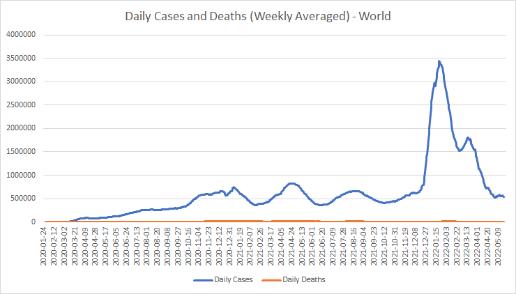
The February 2020 strain of the virus, which caused so much panic and so many deaths, now looks like just a small bump at the far left. The initial January strain can’t even be seen on this scale. The peak in January 2021 was due to the alpha variant. The April 2021 peak, which took place mainly in India, seems to have been a combination of alpha and delta. Delta came into its own to produce the world-wide peak in August 2021.
The huge, sharp peak in January 2022 was down to the
omicron variant, and the brief reversal of the fall in cases in March 2022 was
probably due to the BA.2 sub-variant of omicron. The recent levelling-off in
world-wide cases may be due to another sub-variant such as BA.5, or perhaps
just omicron sub-variants spreading to parts of the world (such as Taiwan) the
variant hadn’t reached before.
Here are the top and bottom 20 countries in cases per
million:


Small communities, particularly islands, and those European countries which have been savviest in dealing with the virus, most notably Denmark, are at the top of this league. Large, low population density countries, and those islands and small communities which kept the virus out for a long time, feature near the bottom. There is also an African bias in the bottom 20, perhaps partly because the virus doesn’t spread well there.
Here are the cases per million on a world map (small
islands and other small countries are not coloured):

Cases per
million (darker is higher)
Which goes to show that, from the point of view of some
hypothetical Gaia Entire, the virus is trivial. Most of the places it has invaded
at high concentrations are small communities. Otherwise, besides Europe and
Turkey, it is the USA, temperate South America, Mongolia and Australia which have
had the highest cases per million.
This also shows up what I call the “latitude effect.”
Conditions between about 30 and 40 (or maybe 50) degrees North tend to favour
the spread of the virus. There may also be a similar band in the Southern hemisphere, but this is unclear because of the north-south set of the countries in southern South America. It’s an application of Sod’s Law: Where conditions are
most comfortable for human beings, there also will conditions be best for
viruses that prey upon us.
Tests
Here are the top and bottom 20 countries in tests per
hundred thousand population:


European and Middle Eastern countries, together with China and Hong Kong, are near the top of the testing list. Poor countries, war zones and African countries tend to be near the bottom.
Cases and tests
So, what has been the effect of varying levels of testing on
reported case counts?

That’s pretty clear. More tests find more cases per million. I can’t help feeling, though, that the real trend line is a lot steeper. After all, at low testing rates, you would expect the cases per million to be directly proportional to tests. I think that “spearhead” pointing from the origin just left of the 1:1 ratio is not an artefact, but the reality. And the countries which have done a lot of testing (more than about 5 times per person) have encountered a saturation effect in the number of cases they found.
Vaccinations
Here are the top and bottom 20 countries in terms of the
percentage of people fully vaccinated. Gibraltar’s strange looking number,
presumably, means that they have been vaccinating people from outside who wish
to enter Gibraltar. At the bottom, six countries (Eritrea, Vatican, Palau,
Micronesia, Marshall Islands, Saint Pierre and Miquelon) have not reported any
vaccination data, so I have excluded them:


Most of the countries with very low take-up of vaccinations are either unusually poor countries, or are in Africa, or are war zones.
Here’s the data on a map:

People
vaccinated % (darker is higher)
Four main areas of high vaccination levels stand out. One
in Europe, particularly in the Catholic countries and Finland. One in the
region formed by China, Japan, Vietnam, Cambodia and Malaysia. The third and
fourth are Canada and Australia. South America also has generally high
vaccination levels, but not as high as much of Europe. Take-up of vaccines in
Africa has been relatively low.
Cases and vaccinations
This is the point at which I can finally try to assess how
much, if anything, vaccinations have done to control cases. Here’s a
scatterplot of cases per million against percentage of the population
vaccinated:
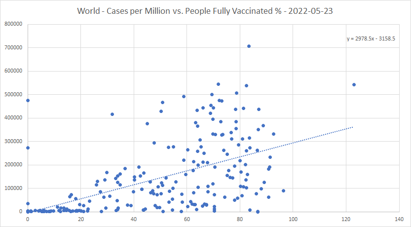
The trend is upwards! For each percent of the population fully vaccinated, there are about 3,000 extra cases per million, or 0.3% of the population. Vaccinations increase cases? No?
But correlation, of course, is not causation. And to put
this in context, here is a scatterplot of cases per million versus the UN’s
Human Development Index rating:

The upward trend per percentage point of UN HDI rating is around two and a half times the upward trend per percent fully vaccinated. Suggesting that the vaccines may have done something to help control the spread of the virus – they appear to cancel out about 60% of the expected increase in cases, that would be caused by development in general. But they certainly haven’t been the “magic bullet” we were led to believe they would be.
Lockdowns
Here are the top and bottom 20 countries in terms of average
lockdown stringency, calculated day by day, over the course of the epidemic:


There are some pretty unpleasant regimes in that top list. Myanmar had a Freedom House rating of only 30%, and that was before the recent coup. Azerbaijan’s rating is 10%, Eritrea’s just 2% (lower than North Korea!), Venezuela’s 16% and China’s is 10%. Then there are governments that have panicked, and held lockdowns stringent for long periods; Peru, Italy and Greece fall into this category.
As both high and low scorers tend to be spread all over
the world, I won’t try to show this data on a map. Instead, I’ll look at the
lockdowns in terms of my “harshness” metric, which seeks to evaluate the
subjective impact of lockdowns on the population:


Jamaica and Trinidad and Tobago don’t strike me as the kind of places where you would expect governments to lock people down just for the hell of it. But that’s what they seem to have done. I was also surprised by the stringency and authoritarianism of the Moroccan lockdowns. We live and learn.
It’s interesting to see Sweden, Iceland, Finland,
Greenland and the Faeroe Islands all down in the bottom 20. The Nordic “light
touch” works! I’m not confident in the COVID statistics for Tanzania, Burundi
or Nicaragua – nor, indeed, Belarus. But it will be interesting to see how the
Japanese come out of this.
Cases and lockdowns
Here is a scatterplot of cases per million against average
lockdown stringency (calculated on a day-to-day basis) over the course of the
epidemic:

Well, that’s a bit of a turn-up. Over the whole course of the epidemic, and across the whole world, average lockdown stringency has made almost no difference to the cases per million! That is different from earlier in the epidemic, such as for example May 2021, when there was a positive correlation – probably caused by governments again and again choosing to lock down whenever daily new cases got uncomfortably high.
I won’t show the scatterplots of cases per million against
individual kinds of lockdown, but the correlation of cases per million with
school lockdowns is small and negative, very close to that for lockdowns as a
whole. Workplace lockdowns show a significant positive correlation. Events and
gatherings lockdowns show a lesser correlation, but still positive;
international lockdowns, a still smaller one. Stay at home, public transport
and travel restrictions lockdowns show a significant negative correlation.
Suggesting that these three lockdowns have been the most effective at
controlling the spread of the virus.
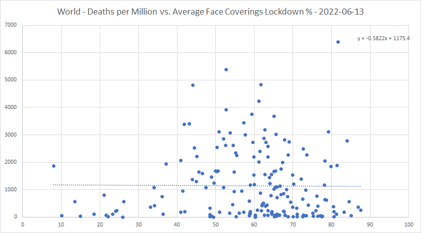
Cases and face masks
Because face mask requirements are not included in the
Blavatnik stringency value, it’s also worth-while to plot cases per million
against average level of face mask requirements over the epidemic:

It looks as if face covering requirements do help to bring down the spread of cases. In fact, the negative correlation is stronger even than for stay at home lockdowns. However, there does seem to be a block of similar looking countries with low cases per million towards the right of the X-axis. This may be because, in much of Africa, face mask lockdowns have been more stringent than in many other parts of the world.
Deaths per million
Here is the graph of deaths world-wide over the course of
the epidemic:

There have been more peaks in the deaths graph than in the cases one. But since February 2022 when the wave of omicron deaths started to recede, the trend has been very much downwards. Note also that tiny, tiny bump at the far left, in February 2020. (As one who caught COVID before it had even been officially reported as being in the UK, that was the strain I had!)
Here are the top and bottom 20 countries in deaths per
million:


As is well known, most of the worst hit countries have been in Eastern Europe and in South America. It is surprising, though, to see the USA in the top 20 list of shame.
At the other end, the bottom six have avoided deaths
altogether. But that figure from China I simply don’t find credible.
Let’s go to the map view:

Deaths per
million (darker is higher)
It’s not just that the virus spreads better in northern
latitudes 30 to 40 (or maybe 50) or so. There also seems to be something that
makes the virus more lethal in these latitudes. From southern Russia and Kazakhstan
to Georgia to Bulgaria and Hungary to Italy, Spain and the USA, there is a band
of quite badly affected countries.
This may also partly account for the relatively high
deaths per million in South Africa, Brazil, Argentina and Chile. But Peru, for
whatever reason, is the worst hit by far.
I’ve looked for academic literature on this subject. There
are a few papers from very early in the epidemic. One, here [[1]],
from March 2020, says: “To date, Coronavirus Disease 2019 (COVID-19), caused by
SARS-CoV-2, has established significant community spread in cities and regions
along a narrow east west distribution roughly along the 30-50o N’ corridor at
consistently similar weather patterns consisting of average temperatures of
5-11oC, combined with low specific (3-6 g/kg) and absolute humidity (4-7 g/m3).”
Another study in early 2021, [[2]],
suggested that “we found latitudes were positively correlated to incidence,
mortality, recovery and active cases with statistical significance
(P = .0001-.0216) and association strengths ranging from weak to moderate (r
ranging from 0.169 to 0.331).” Except in the USA, where it was more correlated
with longitude! But I looked at their supplementary material, and their graphs
are no better than mine. And since then, nothing. I wonder why?
Deaths per million and testing
Since the same “saturation” effect appears on the plot of
deaths per million against tests per hundred thousand as on the plot of cases
per million against tests, I won’t show that plot.
Deaths per million and vaccinations
Next, a scatterplot of deaths per million against
percentage fully vaccinated:

One thing to note here, in the bottom left corner. That cluster with very low deaths per million and low vaccination percentage contains many African countries. It may just reflect that the virus is less lethal in Africa. But in any case, low vaccination does not necessarily lead to high deaths per million. At least, that’s what the data says.
But the trend is still upwards. 13.5 extra deaths per
million for each percent more who are vaccinated. One interpretation is that
governments with more deaths per million may have tried to fix the problem by
vaccination. Which has not worked.
Peru, at the very top, has a high level of vaccinations,
but the worst deaths per million in the world. Gibraltar and Chile also have
high vaccinations and high deaths per million. In Gibraltar, most of the deaths
happened before vaccines were available; and in Peru, the two big deaths peaks
were before the vaccines were fully rolled out. I wonder whether these two
vaccination programs had anything much of a significant effect? Or were they
just window dressing?
Chile, though, shows an interesting pattern of deaths over
time:

The first peak was before vaccines were available. The second, extended peak was during the roll-out. And the third was since the bulk of the roll-out. What this tells us is that whatever vaccine the Chileans used for the general population (I think it may have been the Chinese one) didn’t work very well, if at all, against the omicron variant.
So, the vaccines came too late to make a big difference to
the death toll in these places. Moreover, they didn’t do the job we were told they
would as RNA vaccines, to respond to new variants as they arose. So, all
compulsory vaccination mandates since omicron arrived, even setting aside human
rights issues, have had no objective rationale at all. I call fail.
Deaths per million and lockdowns
Here is a plot of deaths per million against average
lockdown stringency:

20 more deaths per million for every percentage point added to the average lockdown stringency! There’s a headline for you. It’s likely, of course, that causation is the other way. High reported deaths per million cause governments to lock down. But if it could be proven that certain governments panicked unnecessarily, and caused tens of thousands of deaths (or more) that ought to have been avoided… well, you take the drift of my thought.
As to the individual lockdown types: Schools lockdowns,
again, have much the same angle of the trend line as lockdowns as a whole.
Workplace lockdowns have a steeper positive trend, meaning workplace lockdowns
have been less effective than other kinds of lockdown at keeping people alive. Events
and gatherings have a slightly less steep trend than the average of all
lockdowns, but still positive. Public transport and international lockdowns
show a slight negative trend, making them the most effective. And stay at home
and travel restrictions look like the third and fourth most effective lockdown
types at controlling deaths per million.
What, then, would have been the best initial lockdown
strategy for a hard-hit democratic country, if my conclusions can be believed?
Close the borders early, and close public transport. Use stay at home and/or
travel restrictions, but only if the health care system capacity is threatened.
Don’t lock down schools or workplaces at all.
Now, just think. Assume that lockdowns actually were necessary (I know there’s a case otherwise, but that’s not a debate I want to get into today). What would an averagely honest and intelligent human being, faced with this problem of a rampant virus, with these lockdown options to fix it, and with the power to enforce his or her decisions, do? I pride my own judgement enough to believe that, while there might be some improving tweaks, I’ve got at least the outline of the right solution.
Now, think: What did the politicians do, in the UK and
elsewhere? Vice versa.
And what of face coverings?
The negative correlation is very small, but comparable with international and public transport lockdowns. That suggests face coverings have been about as effective in controlling deaths per million as any other kind of lockdown! So, requiring face masks in the most crowded places is probably effective; unless and until you actually want to spread the virus. (As when a less lethal variant, such as omicron, has arrived.)
Deaths per case
Here is the world-wide graph of cumulative deaths per case:

The drop at the start probably reflects that the deaths per case in China were declining at that time. The increase in February 2020 is the effect of the spread of the virus to the rest of an unprepared world. That stutter in early March is interesting. Perhaps the variant, which left China after the Chinese New Year celebrations had finished, and arrived in Iran, Italy and the USA around February 19th to 21st, was more lethal than the initial one? And the rise in deaths per case that started three weeks later in mid-March, perhaps, was due to the new, more lethal variant taking over from the old?
The virus started to become less lethal from May 2020,
perhaps reflecting that many countries were then learning better how to deal
with it. The lethality was roughly constant during 2021; suggesting either that
the virus took much of the “low hanging fruit” during 2020, or that the alpha
and delta variants may have been somewhat less lethal than the previous one.
The downward movement from the end of 2021 onward is the effect of omicron
being less lethal than its predecessors.
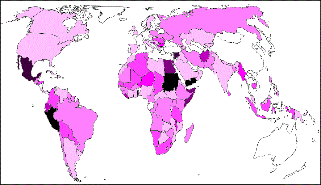
Here are the top and bottom 20 countries in deaths per case:

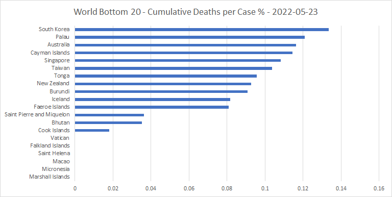
The top 20 includes war zones, very poor countries, and some of the countries (like Peru and Ecuador) whose health care systems were all but overwhelmed by the virus in its first wave. Also, recent war zones like Afghanistan and Somalia.
At the other end are some of the very best performers
against the virus, including Iceland and the Faeroe Islands. Singapore and
Taiwan also make it into the bottom 20 (does Chinese ancestry help against the
virus?) As do Australia and New Zealand. (But we’ll see what happens when they eventually
open up).
The deaths per case data on a map:

Deaths per case
(darker is higher)
While the “hot spots” for deaths per million tend to be in
the temperate latitudes, those for deaths per case are closer to the equator.
Peru, Mexico and Egypt stand out as having very high deaths per case, but not
being war zones. East and South-East Asia, apart from Cambodia, Myanmar and
Indonesia, stand out as having relatively low deaths per case.
Deaths per case and vaccinations
Next, a plot of deaths per case against percentage fully
vaccinated:

That suggests that the vaccines do indeed help to decrease the cumulative deaths per case. For once, the data actually tallies with received wisdom! But, of course, it may just be that many countries hardest hit by the virus were among those that vaccinated earliest and most.
Deaths per case and lockdowns
Here is a plot of deaths per case against average lockdown
stringency:

Higher lockdowns also correlate negatively with cumulative deaths per case, but the effect is small.
As to individual lockdown types: International lockdowns
show a negative trend of more than twice that in the above plot. They are by
far the most effective, on this metric. Workplace, events and gatherings
lockdowns show smaller trends, but still negative. Stay at home, schools, travel
restrictions and public transport lockdowns show positive trends, in that
order. This suggests that the first three of these, in particular, are
counter-productive in terms of deaths per case. Perhaps this may be due to the
adverse psychological effects of long term stay at home mandates, school closures
and travel restrictions?
Excess mortality
Average excess mortality would be a good metric on which to
judge a country’s performance against the virus, if it were not that the less
reliable countries don’t report it. And then there are those that started out
reporting, but then stopped, either at the end of 2020 or when the figures
started to look bad. Nevertheless, I think it’s worth the effort of listing the
top and bottom 20, and showing plots of excess mortality against vaccinations
and lockdowns:


A few countries are “caught out” by this list, showing the discrepancy between their COVID deaths figures and their mortality figures. Kuwait, Tajikistan, Nicaragua and Albania are examples. It’s also interesting to see Kazakhstan up there, as they are in exactly the right place on the globe to get hit hardest by “the latitude effect.”
There are some countries in the bottom 20 which I wouldn’t
regard as trustworthy. But the overall performances of Denmark, Luxembourg,
Japan, Taiwan and the Faeroe Islands against the virus appear to have been very
good. Australia, New Zealand and Canada have had success, but at what cost from
their lockdowns we don’t know yet. China does not provide this data.

That looks as you would expect; more vaccinations lead to lower mortality, by quite a bit too. But the correlation with COVID deaths per million was the opposite! That suggests to me two things. One, on a world-wide basis, the framework for collecting and quality controlling COVID deaths figures, and even excess mortality figures, is rather rickety. And two, the negative correlation between vaccinations and mortality may not be direct, but caused by a common factor; relative economic success, perhaps. Countries that can afford to vaccinate more can also afford better health care.
Last, but very much not least, average excess mortality
versus lockdowns:

Higher lockdowns tend to increase excess mortality! And by quite a bit, too. But this is not as counter-intuitive as it might at first appear. For unnecessarily high lockdowns, much like wars, are bad politics. And bad politics seems to have been, in many places, a significant cause of bad performance against the virus.
Update to June 13th
I thought I’d finish by giving an update to June 13th
for some of the more interesting countries. First, here’s the most recent core
of Europe cases graph:

Portugal (brown) is the high outlier, due to BA.5. And their cases seem just about to have peaked. Many of the other countries also have cases rising, and BA.4 and BA.5 variants are becoming dominant in some places, such as Ireland. But if these variants are no worse than what the Portuguese have just been through, they shouldn’t be too much of a problem for anyone else.
Only one of the countries I identified as needing to
unlock quickly has actually done so in the intervening three weeks. That is
Oman. Japan has opened its borders, but no more.
To three specific countries. Here are cases for Namibia:
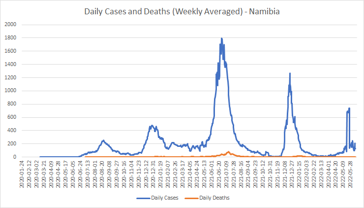
It looks as if they are already over the worst of their fifth peak. If, indeed, the hump was real, and not just a by-product of a large adjustment in the case counts.
Here’s Taiwan:

Well, there you have it. Barring another, even more transmissible variant, they look to have taken on the thing at last, and beaten it, in one fell swoop. With a lockdown stringency of 27%. Why didn’t they do that before?
And the country I was most concerned about, Papua New
Guinea:

I think they may have grossly underestimated their cases, but I have no reason to suppose that the proportion of undercounting would be likely to change much with time. So, it looks as if there’s nothing to see here, move on.
Perhaps, just perhaps, the fat lady can start gargling again soon?


