
This is the fifth of my
review reports on COVID-19 worldwide as at August 20th 2021. This
report will cover deaths attributed to COVID per million population, and excess
mortality (from all causes), in the 191 countries which have reported COVID
cases.
Excess Mortality
Deaths per million from
COVID are reported daily by all countries which have reported at least one
COVID case. Excess mortality figures, on the other hand, are only reported by a
subset of 89 countries – about 47% of the total. Excess mortality in a period
is defined as the number of deaths from all causes in that period, divided by
the average number of deaths from all causes in the same period over a number
of years which together define a reference period, then converted to a
percentage, and 100% subtracted from the result. The reference period used for
the Our World in Data feed is the years 2015 to 2019 inclusive. The reporting
period for excess mortality figures can vary from country to country, but it is
usually either a week or a month; though it can occasionally change, or there
may be gaps.
Thus an excess mortality
of, say, 100% in a period means that the deaths in the period were twice the
average level for the same time of year over the course of the reference
period. An excess mortality of minus 5% means that deaths in the period were
95% of the average level for the reference period.
One advantage of excess
mortality as a metric is that it is calculated completely independently from
COVID statistics such as cases, tests and deaths. It is also, in most
countries, calculated by a separate governmental function from the COVID
statistics. Thus, where provided, it should enable inter-country comparisons
without regard to variations in parameters such as COVID test kit availability,
health system quality, or propensity to fudge COVID figures in particular
countries.
My “magic spreadsheets” can
give me two different measures of excess mortality in a country. One, the
current excess mortality, is simply the latest excess mortality figure which
has been reported for that country. The other, the average excess mortality, is
the simple average of all the excess mortality figures over the course of the
epidemic. Unlike lockdown stringencies, I make no attempt to weight excess
mortality figures by how many days each figure covers.
Europe
I’ll start, as usual, in Europe. Here, I’ll show daily
deaths per million (weekly averaged) and average excess mortality graphs next
to each other for each of my four groups of European countries. Many of the
deaths per million graphs are similarly shaped, at least over relatively short
periods, to the cases per million graphs in my second report, offset by an
average of about 21 days (which is the mean time between a case being reported
and death supervening). However, deaths per million are also affected by the
ratio of deaths per new case, which can vary at different times of the
epidemic, even within one country. I plan to discuss deaths per case in the next
(sixth) report.


You can pick out some of the same features on both graphs, such as early peaks in Spain and Belgium, and somewhat later peaks in Portugal and the UK. The excess mortality also shows clearly the decline in the general level of mortality through 2021 in many of the countries.


These graphs both show quite clearly that in most of these countries, the epidemic didn’t really “get going” until October 2020. And that since then, mortality peaks have been declining for most of the time.


Here again, it looks as if the epidemic started spreading in Eastern Europe only when the “first wave” in Western Europe was over. The recent uptick in deaths doesn’t show in the excess mortality, because many countries’ figures haven’t been calculated yet.


Because these are mostly small countries, the deaths per million graph doesn’t show anything very much. The excess mortality graph is far more instructive, particularly the downward slope of the peaks.
The four excess mortality graphs, taken together, show
that the countries hit hardest at the peaks – Spain, Belgium, the UK, Poland,
Czechia, North Macedonia, Bulgaria, Albania, San Marino, Andorra, Liechtenstein
– have all suffered excess mortalities above 100% at some point in the
epidemic. And Hungary had two large waves, both of which were not far under
100%. So much for those who try to make out that COVID is no more lethal than a
’flu!
Americas


Unlike in Europe, different countries don’t move together here. But Mexico, El Salvador and Panama have both been above 100% excess mortality; Panama almost to 200. And Mexico twice over.


Excess mortality in South America seems to be far worse than further north. Perhaps they got a more lethal variant than anyone else? Or, perhaps, their health care systems are worse than those of other countries? Ecuador, Bolivia and Peru have all been over 250%, and Peru has had four peaks. Paraguay and Colombia, too, have been over 100%.


Deaths per million in the West Indies are comparable with North America; lower than South. And the excess mortality data for both Cuba and Jamaica trails off before the end of 2020.
Middle East and North Africa


Peaks of deaths per million here are close to those in North America, except for Lebanon. And Armenia suffered a big peak in excess mortality near the end of 2020.


These graphs tend to suggest that COVID is still building up in this region! Israel, Jordan, Palestine, Israel again, Jordan again, Bahrain and Oman have had significant peaks in deaths. And even in Israel, which has done a lot of vaccinating, the epidemic isn’t over yet.


Those rising deaths in Tunisia don’t look very good. But Egypt looks worse. Their daily deaths per million have never been above 1, and their reported cases have only reached 0.28% of the population. Yet they have twice had excess mortality above 70%? My bullshit meter fires immediately.
The Egyptian deaths monitoring system is reputed to be as
good as any in Africa; so, I suspect the excess mortality figures may be
correct, and they have been missing a lot of COVID cases. And deaths, too. Even
the media are starting to notice this: https://www.dw.com/en/authoritarian-states-obscuring-covid-death-tolls-study-shows/a-58771888.
Rest of Asia


Both the deaths and excess mortality figures (apart from one excursion in Hong Kong) here are way lower than in Europe or the Americas. But the excess mortality data doesn’t yet cover the most interesting phases of the epidemic in this region. And which is the only country in this group which isn’t providing excess mortality figures? You’ve guessed it. China. Ah, China.


That big peak in excess mortality in Azerbaijan doesn’t really tally with the small number of deaths per million compared with the countries around it. Another authoritarian state fudging COVID data, perhaps? And Georgia’s data peters out at the end of 2020.
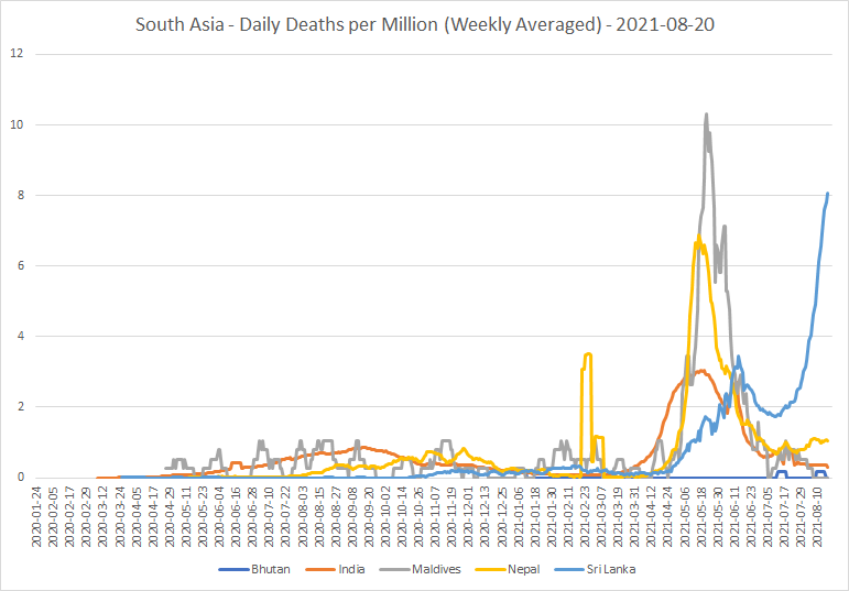
There are no excess mortality figures for any of these countries. So, my best guess is that the epidemic still has a long way to run in this part of the world, except in the Maldives.


On the daily deaths per million curves, I get the same feeling here as I did for South Asia. Except, perhaps, in the case of Singapore, which seems to have done a very good job so far in controlling the virus; only 1.13% of the population have become cases, and there have only been 8 deaths per million. The excess mortality data here shows up the relative lack of COVID deaths in this region.
Sub-Saharan Africa


It’s a pity the Seychelles excess mortality figures peter out at the end of 2020, since the epidemic there didn’t really start until 2021!


Mauritius’ excess mortality data has the same problem as the Seychelles did; it ends before the period of greatest interest (from June 2021) begins.

In short, there really isn’t much to see in this part of the world.
Australasia and Oceania


In common with other relatively remote places, the epidemic in this part of the world doesn’t yet seem to have got its boots on. The Australian and New Zealand excess mortality data is interesting, though; it gives an idea of what the excess mortality elsewhere might have been without COVID! And of a “natural variability,” of the order of plus or minus around 10% to 12%. Note that mortality has tended to be lower in the local winter and higher in the local summer than it was during the reference period 2015 to 2019.
Top and bottom 20
Here are the lists of the top and bottom 20 countries in
cumulative deaths per million:


This suggests some countries which may well be worth a closer look. Peru and Hungary, obviously. Brazil will be interesting, too. Bhutan, Singapore and Grenada are three (so far) well-performing countries, which I haven’t looked at before; and since none of them are in Africa, I can probably believe their data.
Here are the lists of top daily deaths per million currently
– the “hot spots” of COVID mortality as of August 20th 2021:

Geographically, that’s a bit of a mixed bag; but Georgia, Fiji, Sri Lanka and Cuba seem worth a closer look.
There’s no point giving the bottom 20, because each week
there are many countries recording no deaths at all in the week. So,
I’ll go on to the top and bottom 20 in average excess mortality:

You can see, right there, which parts of the world have been hit hardest by the virus over the course of the epidemic. Eight of the top 10 are in Central or South America! And they include Nicaragua, which has by a long way the lowest reported case counts in the region. The Egyptians are not the only régime to fudge the COVID figures, only to be caught out by their very own deaths recording system!
I'll add Ecuador and Mexico to my list, too.

The Seychelles figures are so out-of-date that they are misleading. But Norway? Negative excess mortality, when considered over the epidemic as a whole? They will have to go on my list for a closer look. And note that Iceland, Denmark, Finland and Sweden are in the same bottom 20! Japan and Hong Kong are also worth putting on the list, as being two of the places nearest to China whose data is likely to be reliable.
And here are the lists of the top and bottom 20 in current
excess mortality (from among those reporting):


Oman, Bolivia and Colombia are worth adding to the list, too.
Those numbers for Liechtenstein, Iceland and Switzerland
are amazing! They will all have to go on the list for further detail. It’s
interesting to see Norway, Sweden and Finland all joining Iceland in the bottom
20. It’s also heartening to see that Hungary, Israel, Belgium, and Czechia,
four countries which have been hit particularly hard by the virus, now have
significantly negative excess mortality figures. That gives a warm feeling
that, for these countries at least, herd immunity may now not be so far away.
I see that I have added so many countries to my list, that
I do not have space to include more detail in this particular report. I also
expect to find (at least) a few more countries needing more investigation as a
result of looking at the deaths per case statistics. I now therefore plan to do
these follow-ups as a separate report, following the deaths per case report.
To sum up
South and Central America have been hit hardest by the
COVID-19 virus, so far. Both in terms of deaths per million, and of excess
mortality. Europe is in second place, and the Middle East and North America vie for third.
But in those places like Africa, Asia and Australasia, which
initially dealt well with the virus, it looks as if it’s now starting to get
going.
Hearteningly, some of the countries worst hit by the virus
now have negative excess mortality. This is something you would expect to be a
harbinger of approaching herd immunity.
No comments:
Post a Comment