
Cumulative deaths
per case (darker is higher)
The COVID epidemic appears to be on the wane in most European
countries. The fat lady hasn’t sung a note yet, but she’s gargling. So, I
thought now would be a good time to take another look at the COVID data from
around the world. This time, I’ll return to my original classification scheme, dividing
the world into six “supergroups” of countries by geographical area: Europe,
Americas, Middle East and North Africa, Australasia and Oceania, Sub-Saharan
Africa and Rest of Asia. The final report will look at the world as a whole.
In this series of reports, I’ll focus on cases, hospital and
ICU occupancy (where reported), and deaths. Vaccination and lockdown data,
where available, will be included, but only for the purpose of putting the
other figures into context. Testing will not even be mentioned in this series
of reports, as it isn’t a big factor at this stage of the epidemic. That subject
will be reserved, along with assessment of the effectiveness (or not) of
lockdowns and vaccines, for a later series of “post-mortem” reports.
This time, I’ll divide the European report into two. The
first part will address my “core 14” list of European countries, including
individual data for the constituent nations of the UK. The second will deal
with the remainder of Europe.
All the data in this series of reports was taken from the
usual sources, Our World in Data and the Blavatnik School of Government, together with the UK government COVID
dashboard for individual nations’ data within the UK. The data was taken on May
24th 2022, and runs up to May 23rd 2022.
Vaccinations
Here is the list of percentages of people fully vaccinated:

Not much difference between the highest and the lowest.
Lockdowns
Here is the spaghetti graph of lockdown stringency over the
course of the epidemic:

A strong downward trend is evident in recent months. It looks as if most of the governments have decided that the epidemic is all but over in the core of Europe. For this summer, at least.
Here is the list of current lockdown stringencies, and the
individual lockdowns which make them up:


As an aside, the UK-wide Blavatnik data shows a “schools closures recommended (regional)” lockdown, which isn’t to be found in any of the constituent countries’ data. I suspect that the UK’s actual lockdown stringency is now the same as Sweden, Portugal, Denmark and Ireland.
I’ll also show my measure of “harshness,” which only includes
mandates not recommendations, includes face covering mandates, and weights
lockdowns which affect everyone higher than those which affect only some:

Denmark, Ireland, Sweden, Portugal and the UK now have no mandatory lockdowns. Switzerland has only International: Ban some arrivals.
Spain is showing an incorrect, low harshness value. This
is because its Blavatnik data since March 15th has been
mis-formatted. I don’t know what the true situation is there, but the record
for March 15th shows: Workplaces: Some closed (Regional), Events:
Mandatory cancelled (Regional), Gatherings: Up to 11-100 (Regional),
International: Ban some arrivals, Face covering: Required in some places.
Germany has International: Screening, Face covering: Required in some places. The calculated harshness value as of March 15th was 34.375.
France, the Netherlands, Belgium and Luxembourg all have International:
Ban some arrivals, Face covering: Required in some places. Austria has Schools:
Some closed (Regional), Workplaces: Some closed, Gatherings: Up to 101-1000,
Face covering: Required in some places. And Italy has Workplaces: Some closed,
International: Quarantine high-risk, Face covering: Required in some places.
Cases
Here are the cases per million so far for the core 14
countries, and for the UK constituent nations:

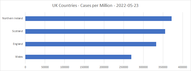
The percentage of people diagnosed as cases varies between 25% (Sweden) and 54% (Denmark).
Here is a map, with cases per million shown by colour:

Cases per
million in the core of Europe (darker is higher)
Here is the graph of daily cases per million (weekly
averaged):

With one exception, the cases per million all seem to be gently settling down towards zero. That exception is Portugal (brown line), where there has been a recent surge in cases of a new variant called BA.5. This appears to be more transmissible than the currently dominant variant BA.2. See https://www.theguardian.com/world/2022/may/20/two-types-omicron-classified-covid-variants-concern-uk-ba4-ba5.
Data from South Africa, where this variant has been
present for several months, suggest that BA.5 is not significantly different in
hospitalization probability or lethality from other strains of omicron. So,
there should be no great cause for alarm, unless and until the Portuguese new
case count starts to approach its previous peak. Although, as of May 27th,
it was still rising. It's interesting, though, that this is happening in
Portugal, which is fourth out of the 14 in cases per million, and highest of
all in vaccinations!
BA.5 is already in several countries including the UK, but
case numbers are small at the moment. My best guess is that there will be another
peak in BA.5 cases in the UK, probably of similar size to the peak in March,
when BA.2 took over from BA.1 as dominant variant. That ought not to be a big problem
for any health care system. But this is the NHS, after all.
Hospital occupancy
Here are the hospital occupancies by COVID patients per
million population. All the 14 countries except Germany provide this data. The
percentages of available hospital beds which are occupied by COVID patients are
also shown:


Here is the same data looked at in terms of weekly growth in hospital occupancy:

No cause for alarm at the moment, except in Portugal, and possibly in neighbouring Spain. But there is still a fair bit of slack in both, compared with the peaks earlier in the epidemic.
Intensive Care Unit occupancy
Here are the ICU occupancies by COVID patients per million
population. The percentages of available ICU beds which are occupied by COVID
patients are also shown:


That has to be a bit worrying for the Portuguese, whose
ICU occupancy by COVID patients was amazingly high at the peak of the epidemic.
And here is the same data looked at in terms of weekly
growth in ICU occupancy:

That has to be even more worrying for the Portuguese. But at least, when their cases peak out, we’ll know what BA.5 can do.
Deaths
Here are the deaths per million so far:


The percentage of the population who have died of COVID varies between 0.11% (Denmark) and 0.275% (Italy). The percentage of deaths in England is very close to that in Italy. And interestingly, the percentage of deaths in Northern Ireland (0.18%) is far closer to that in the Republic of Ireland (0.145%) than to that in the UK as a whole (0.26%). I wonder why?
Now here is a map, with deaths per million shown by colour:

Deaths per
million (darker is higher)
That’s interesting. Relatively good performances by
Denmark, the Netherlands, Luxembourg, Germany and Switzerland; as well as by
the Irish. And Italy, Belgium and the UK are the three worst, in that order.
Looking at the data in terms of deaths per case:


Here is another map, with deaths per case shown by colour:

Cumulative deaths
per case (darker is higher)
As this metric says a lot about the general state of a
country’s health system, that map is very revealing. Italy and Spain are the
worst, by far. Sweden, the UK and Belgium made major mistakes, and lost a lot
more people than they ought to have. And Denmark and the Netherlands are
outstanding on deaths per case, compared with the rest.
Here are the spaghetti graphs of daily deaths per million
and excess mortality (relative to 2015 to 2019), for comparison:


If the two correlate well at a particular time in a particular country, that means that COVID was a major (or the major) cause of mortality in that country at that time. There is a qualitative similarity between the graphs, but the excess mortality is much higher at the first peak, compared with the COVID deaths, than at the second. In the case of the UK (pink lines), the first peak in excess mortality is about 166% of the peak of COVID deaths. Suggesting that a lot of early COVID cases (and so deaths) were missed. I suggest this will be a fruitful area to investigate when it comes to the “post-mortem” reports!
That being said, despite a few excursions – most recently
in Denmark (grey line) in March, and the recent spike in Portugal – the COVID
deaths per day counts do seem to be settling down towards zero.
To sum up
Five of the 14 core European countries, Denmark, Ireland,
Sweden, Portugal and the UK, now have no mandatory lockdowns. And Switzerland
has no mandatory lockdowns except at the border.
Daily cases, hospital and ICU occupancy, and deaths per
million are still settling downwards in most of the countries. But Portugal is currently
experiencing a surge of cases of variant BA.5, with consequent increases in
these figures.
BA.5 is already in the UK and other countries, but is not
yet dominant except in Portugal. My best guess is that in the UK it will lead
to another peak in cases comparable with the March peak, when BA.2 took over
dominance from BA.1.
The fat lady will have to put away her gargle for a few
weeks or months yet. But there doesn’t seem to be any cause for alarm about COVID
causing health care resources to run out again in the core of Europe.
No comments:
Post a Comment